I recently had an interesting discussion about CSS modules vs. CSS-in-JS and more specifically Emotion. We’ve been working on a codebase that uses CSS modules for a while now, and we’ve certainly come up with lots of patterns that make it easy to reason about CSS and keep it maintanble at scale. One of the central ideas are variants. For example we would create a base card component of certain color, size, shape and even hove state, but it would also have an optional variant property that would completly change the card’s appearance.
1. The naïve case
To implement a card component with Emotion (or styled components) one could come up, with something like this: (The CSS properties are not really important. This is just an example.)
import styled from '@emotion/styled';

type IProps = { isVertical: boolean };

const Box = styled.div<IProps>`
  display: flex;
  padding: 0.5rem;
  flex-direction: ${({ isVertical }) => (isVertical ? 'column' : 'row')};
  ${({ isVertical }) =>
    isVertical ? 'justify-content: center;' : 'align-items: center;'};
  background: ${({ isVertical }) =>
    isVertical ? 'var(--red);' : 'var(--blue);'};
`;

export default function Card({ isVertical }: IProps) {
  return <Box isVertical={isVertical}>Box1</Box>;
}
The feedback I got on this, was that this is hard to read, and I agree. Compare how this could look like with CSS modules:
.container {
  display: flex;
  padding: 0.5rem;

  .isVertical {
    justify-content: center;
    flex-direction: column;
    background: var(--red);
  }

  .isHorizontal {
    align-items: center;
    flex-direction: row;
    background: var(--blue);
  }
}
Much cleaner! Much easier to read! However, I didn’t want to give up there, as CSS-in-JS has a lot of benefits. So here are 15 different ways to style variants with CSS-in-JS.
But before we get into it, here a few things to point out:
- I’m hiding the additional utility code required to make each solution work, but I’ll include it in an expandable section.
- I’m using Emotion, but most of it should apply to styled components as well.
- I’m including the generated CSS output for each solution in an expandable section as well.
- I designed all solutions so that they won’t break syntax highlighting (I’m using
jpoissonnier.vscode-styled-componentsin VS Code).
That said, let’s get started!
2. Using a helper function
You can pass a function (“interpolations”) to a styled component’s template literal to adapt it based on its props. Each function receives the components properties and has to return a string or a SerializedStyles:
import { css } from '@emotion/react';
import styled from '@emotion/styled';

const alignBox = ({ isVertical }) =>
  isVertical
    ? css`
        justify-content: center;
        flex-direction: column;
        background: var(--red);
      `
    : css`
        align-items: center;
        flex-direction: row;
        background: var(--blue);
      `;

const Box = styled.div`
  display: flex;
  padding: 0.5rem;
  ${alignBox}
`;

export default function Card({ isVertical }) {
  return <Box isVertical={isVertical}>Box2</Box>;
}
Generated CSS
.css-1uknui7{display:flex;padding:0.5rem;justify-content:center;flex-direction:column;background:var(--red);}
.css-1svseed{display:flex;padding:0.5rem;align-items:center;flex-direction:row;background:var(--blue);}
Alternative with switch statement
import { css } from '@emotion/react';
import styled from '@emotion/styled';

const boxVariants = ({ variant }) => {
  switch (variant) {
    case 'vertical':
      return css`
        justify-content: center;
        flex-direction: column;
        background: var(--red);
      `;

    case 'vertical':
      return css`
        align-items: center;
        flex-direction: row;
        background: var(--blue);
      `;
  }
};

const Box = styled.div`
  display: flex;
  padding: 0.5rem;
  ${boxVariants}
`;

export default function Card({ isVertical }) {
  return <Box variant={isVertical ? 'vertical' : 'horizontal'}>Box2b</Box>;
}
Pros:
- Fairly straightforward
Cons:
- Fragmented CSS
3. Using ifTrue/ifFalse helpers
import { css } from '@emotion/react';
import styled from '@emotion/styled';
import { ifTrue, ifFalse } from "utils";

type IProps = { isVertical: boolean };

const Box = styled.div<IProps>`
  display: flex;
  padding: 0.5rem;

  ${ifTrue(
    'isVertical',
    css`
      justify-content: center;
      flex-direction: column;
      background: var(--red);
    `,
  )}

  ${ifFalse(
    'isVertical',
    css`
      align-items: center;
      flex-direction: row;
      background: var(--blue);
    `,
  )}
`;

export default function Card({ isVertical }: IProps) {
  return <Box isVertical={isVertical}>Box3</Box>;
}
Generated CSS
.css-emqkiy{display:flex;padding:0.5rem;justify-content:center;flex-direction:column;background:var(--red);}
.css-1kdt7cc{display:flex;padding:0.5rem;align-items:center;flex-direction:row;background:var(--blue);}
Implementation - How it works
export const ifTrue = (condition, css) => (props) => props[condition] ? css : '';
export const ifFalse = (condition, css) => (props) => props[condition] ? '' : css;
Pros:
- Easy to understand
Cons:
- Requires (extremly simple) util functions
- Still doesn’t look like CSS
4. Using switchProp helper
Inspired by styled-tools this helper switches a set of CSS properties based on a component property:
import { css } from '@emotion/react';
import styled from '@emotion/styled';
import { switchProp } from "utils";

type IProps = { variant: 'vertical' | 'horizontal' };
type IStyleProps = { variant: 'vertical' | 'horizontal' };

const Box = styled.div<IStyleProps>`
  display: flex;
  padding: 0.5rem;

  ${switchProp('variant', {
    vertical: css`
      justify-content: center;
      flex-direction: column;
      background: var(--red);
    `,
    horizontal: css`
      align-items: center;
      flex-direction: row;
      background: var(--blue);
    `,
  })};
`;

export default function Card({ isVertical }: IProps) {
  return <Box variant={isVertical ? 'vertical' : 'horizontal'}>Box4</Box>;
}
Generated CSS
.css-1eoyon3{display:flex;padding:0.5rem;justify-content:center;flex-direction:column;background:var(--red);}
.css-158a9qy{display:flex;padding:0.5rem;align-items:center;flex-direction:row;background:var(--blue);}
Implementation - How it works
const switchProp = (prop, options) => (props) => options[props[prop]];
Pros:
- Easy to understand
Cons:
- Requires (extremly simple) util functions
- Still doesn’t look like CSS
5. Using Emotions css property
The css property allows developers to style components and elements directly without the styled components API abstraction. It is similar to the HTML style prop, but also has support for auto vendor-prefixing, nested selectors, and media queries.
/** @jsxImportSource @emotion/react */
import { css } from '@emotion/react';
import styled from '@emotion/styled';

type IProps = { isVertical: boolean };

const Box = styled.div`
  display: flex;
  padding: 0.5rem;
`;

const variants = {
  is_vertical: css`
    justify-content: center;
    flex-direction: column;
    background: var(--red);
  `,

  is_horizontal: css`
    align-items: center;
    flex-direction: row;
    background: var(--blue);
  `,
};

export default function Card({ isVertical }: IProps) {
  return (
    <Box css={isVertical ? variants.is_vertical : variants.is_horizontal}>
      Box5
    </Box>
  );
}
Generated CSS
.css-im4vzl-Card{display:flex;padding:0.5rem;justify-content:center;flex-direction:column;background:var(--red);}
.css-vj3p5z-Card{align-items:center;flex-direction:row;background:var(--blue);}
Pros:
- Easy to understand
- No util functions
Cons:
- Fragmented CSS
- Generated CSS
classNamegets suffixed with component name (Card) - Requires adding
@jsxImportSource @emotion/reactat the top of every component file
6. Extending components
To make a new component that inherits the styling of another component, styled components allows to extend styles.
import styled from '@emotion/styled';

type IProps = { isVertical: boolean };

const Box = styled.div`
  display: flex;
  padding: 0.5rem;
`;

const VerticalBox = styled(Box)`
  justify-content: center;
  flex-direction: column;
  background: var(--red);
`;

const HorizontalBox = styled(Box)`
  align-items: center;
  flex-direction: row;
  background: var(--blue);
`;

export default function Card({ isVertical }: IProps) {
  const Box = isVertical ? VerticalBox : HorizontalBox;
  return <Box>Box6</Box>;
}
Generated CSS
.css-1pthnx7{display:flex;padding:0.5rem;justify-content:center;flex-direction:column;background:var(--red);}
.css-emoj78{display:flex;padding:0.5rem;align-items:center;flex-direction:row;background:var(--blue);}
Pros:
- Easy to understand
- Uses analogy of class inheritance
- No util functions
Cons:
- Fragmented CSS
- Additional components
7. Using a global class name with &.
Although potentially dangerous, styled-components allows you to decleare global classes. Combined with the &. selector, classes can be scoped however. It’s important to point out that this will still cause problems for the component when there are other classes in the global scope with the same name.
import styled from '@emotion/styled';

type IProps = { isVertical: boolean };

const Box = styled.div`
  display: flex;
  padding: 0.5rem;

  &.is_vertical {
    justify-content: center;
    flex-direction: column;
    background: var(--red);
  }

  &.is_horizontal {
    align-items: center;
    flex-direction: row;
    background: var(--blue);
  }
`;

export default function Card({ isVertical }: IProps) {
  return (
    <Box className={isVertical ? 'is_vertical' : 'is_horizontal'}>
      Box7
    </Box>
  );
}
Generated CSS
.css-17agxao{display:flex;padding:0.5rem;}
.css-17agxao.is_vertical{justify-content:center;flex-direction:column;background:var(--red);}
.css-17agxao.is_horizontal{align-items:center;flex-direction:row;background:var(--blue);}
Pros:
- No fragmented CSS
- Great readibility
- Creates three css classes, rather than two with duplicated proper
Cons:
classNameis not scoped and could collide with global classes with same name
8. Using a unique classname
To avoid the problem above, one could come up with a way to generate unique and collision free class names.
import styled from '@emotion/styled';
import { generateStableClassName } from 'utils';

type IProps = { isVertical: boolean };

const cs = generateStableClassName('card');

const Box = styled.div`
  display: flex;
  padding: 0.5rem;

  &.${cs}__is_vertical {
    justify-content: center;
    flex-direction: column;
    background: var(--red);
  }

  &.${cs}__is_horizontal {
    align-items: center;
    flex-direction: row;
    background: var(--blue);
  }
`;

export default function Card({ isVertical }: IProps) {
  return (
    <Box className={isVertical ? `${cs}__is_vertical` : `${cs}__is_horizontal`}>
      Box8
    </Box>
  );
}
Generated CSS
.css-1a3ausu{display:flex;padding:0.5rem;}
.css-1a3ausu.css-5403ea20__is_vertical{justify-content:center;flex-direction:column;background:var(--red);}.css-1a3ausu.css-5403ea20__is_horizontal{align-items:center;flex-direction:row;background:var(--blue);}
Implementation - How it works
// For example we could add a unique prefix (`csx`) that would reduce the risk of class name collisions.
// Additionally, we could hash a keyword to shorten the classname

function generateStableClassName(keyword) {
  return `csx-${hash(keyword)}`;
}

// This is a better hashing function that the one used above
function hash(b) {
  let a = 0;
  let c = b.length;
  while (c--) (a += b.charCodeAt(c)), (a += a << 10), (a ^= a >> 6);
  a += a << 3;
  a ^= a >> 11;
  return (((a + (a << 15)) & 4294967295) >>> 0).toString(16);
}
Pros:
- Reduced risk of class name collisions in global scoped
- 3 classes
Cons:
- Keyword must be unique
- Can not use random number which would be unstable between SSR and CSR
__is_vertical/__is_horizontalin class name
9. Using a classname generator
To avoid having __is_vertical/__is_horizontal in the class name, we could generate multiple globally unique class names.
import styled from '@emotion/styled';
import { makeLocalScope } from 'utils';

type IProps = { isVertical: boolean };

const local = makeLocalScope('Card');

const Box = styled.div`
  display: flex;
  padding: 0.5rem;

  &.${local('is_vertical')} {
    justify-content: center;
    flex-direction: column;
    background: var(--red);
  }

  &.${local('is_horizontal')} {
    align-items: center;
    flex-direction: row;
    background: var(--blue);
  }
`;

export default function Card({ isVertical }: IProps) {
  return (
    <Box className={isVertical ? local(`is_vertical`) : local(`is_horizontal`)}>
      Box9
    </Box>
  );
}
Generated CSS
.css-nbsacf{display:flex;padding:0.5rem;}
.css-nbsacf.csx-2ef1a8d0{justify-content:center;flex-direction:column;background:var(--red);}
.css-nbsacf.csx-89843ad3{align-items:center;flex-direction:row;background:var(--blue);}
Implementation - How it works
const makeLocalScope = (scope) => (prop) => `csx-${hash(`${scope}-${prop}`)}`;

// function hash: See solution 8
Pros:
- No more
__is_vertical/__is_horizontalin class name
Cons:
- Not SSR/CSR stable if random numbers are used in hash
- Class names must be wrapped in
localwhen used
10. Auto-replace class names (plus React 18 useId)
Instead of making you remeber to always wrap your class names in local, we could automatically replace them by using a wrapper component that translates class names.
This solution also uses the new useId hook which will be introduced in React 18 to create stable Ids between server an client.
import styled from '@emotion/styled';

type IProps = { isVertical: boolean };

const BoxInternal = styled.div<{ id: string }>`
  display: flex;
  padding: 0.5rem;

  ${local('is_vertical')} {
    justify-content: center;
    flex-direction: column;
    background: var(--red);
  }

  ${local('is_horizontal')} {
    align-items: center;
    flex-direction: row;
    background: var(--blue);
  }
`;

const Box = WithWrapper(BoxInternal);

export default function Card({ isVertical }: IProps) {
  return (
    <Box className={isVertical ? 'is_vertical' : 'is_horizontal'}>Box10</Box>
  );
}
Generated CSS
Implementation - How it works
import { useId } from 'react'; // React18 only

function hash(x) {
  return btoa(x).substring(0, 6);
}

function WithWrapper(Internal) {
  return function StyledWrapper({ className, ...rest }) {
    const id = hash(useId());

    const classNamesScoped = className
      .split(' ')
      .map((c) => `csx-${id}-${c}`)
      .join(' ');

    return <Internal className={classNamesScoped} id={id} {...rest} />;
  };
}

export const local = (name) => (props) => `&.csx-${props.id}-${name}`;
Pros:
- Easy to read CSS
- Classes based into
<Box />do not need to be scoped / wrapped withlocal
Cons:
- Requires wrapping components
- Requires adding
{ id: string }type definition
11. Using a classname generator based on css
To take it one step further, styled-components allows you to use the css property to generate class names, which come with a globally unique classnames. Alternatively we can create our own hash based on the CSS content. However both approaches require wrapping .is_vertical/.is_horizontal in a css function.
import { css } from '@emotion/react';
import styled from '@emotion/styled';
import { local, styles } from "utils";

type IProps = { isVertical: boolean };

const Box = styled.div`
  display: flex;
  padding: 0.5rem;

  ${local(
    'is_vertical',
    css`
      justify-content: center;
      flex-direction: column;
      background: var(--red);
    `,
  )}

  ${local(
    'is_horizontal',
    css`
      align-items: center;
      flex-direction: row;
      background: var(--blue);
    `,
  )}
`;

export default function Card({ isVertical }: IProps) {
  return (
    <Box className={isVertical ? styles.is_vertical : styles.is_horizontal}>
      Box11
    </Box>
  );
}
Generated CSS
.css-2yb6us{display:flex;padding:0.5rem;}
.css-2yb6us.css-1vbbust{justify-content:center;flex-direction:column;background:var(--red);}
.css-2yb6us.css-pyot8z{align-items:center;flex-direction:row;background:var(--blue);}
Implementation - How it works
export const styles: Record<string, string> = {};

export const local = (name, css) => () => {
  // careful: css.name can start with a number, which is not a valid CSS class
  // name. We'll prefix the class name with "css-" to avoid this.
  styles[name] = `css-${hash(css)}`;
  return { [`&.${styles[name]}`]: css };
};

// `SerializedStyles` come with a generated class name, we can just use that
const hash = (css: { name: string }) => css.name;

// ...or generate our own hash based on the content (keeping it simple here, there are certainly better hashing functions)
const hash = (list: { styles: string }) =>
  list.styles
    .split('')
    .reduce((acc, item) => acc + item.charCodeAt(0), 0)
    .toString(36);
Pros:
- Creates three css classes, rather than two with duplicated properties
Cons:
- Less nice to read CSS
- Not stable between client and server (Shouldn’t be used for server side rendering)
12. Pre-generating scoped class names
Wouldn’t it be nice if styles were more scoped and also had typescript support, so we could check whether styles.is_vertical does exist or not. And also get auto-completion.
Also while we’re at it, let’s move the css class name generation out and create new classes in the background.
import { css } from '@emotion/react';
import styled from '@emotion/styled';
import { scoped } from "utils";

type IProps = { isVertical: boolean };

const styles = scoped(['is_vertical', 'is_horizontal'] as const);

const Box = styled.div`
  display: flex;
  padding: 0.5rem;

  &.${styles.is_vertical} {
    justify-content: center;
    flex-direction: column;
    background: var(--red);
  }

  &.${styles.is_horizontal} {
    align-items: center;
    flex-direction: row;
    background: var(--blue);
  }
`;

export default function Card({ isVertical }: IProps) {
  return (
    <Box className={isVertical ? styles.is_vertical : styles.is_horizontal}>
      Box12
    </Box>
  );
}
Generated CSS
Implementation - How it works
let counter = 0;

export function scoped<T extends readonly string[]>(
  list: T,
): { [P in T[number]]: string } {
  function getScopedClassName(cx) {
    // By adding a globally unique property, we can force emotion to generate a new CSS class everytime
    const placeholderClass = css`
      content: ${cx}-${counter++};
      label: ;
    `;
    return `css-${placeholderClass.name}`;
  }

  return list.reduce<any>((styles, item) => {
    styles[item] = getScopedClassName(item);
    return styles;
  }, {});
}
Pros:
- CSS not fragmented
- Good Typescript support.
styleswill be fully typed. - Similar to CSS modules
Cons:
- Requires pre-defining the scoped class names
- Relies on hacks to trick emotion into generating class names
- Relies on counter which needs to be stable between SSR and CSR
13. Using a placeholder Symbol + augmenting className through a wrapper component
import styled from '@emotion/styled';

type IProps = { isVertical: boolean };
const LOCAL = Symbol('PLACEHOLER_SYMBOL');

const Box = styled.withLocal.div`
  display: flex;
  padding: 0.5rem;

  ${LOCAL}is_vertical {
    justify-content: center;
    flex-direction: column;
    background: var(--red);;
  }

  ${LOCAL}is_horizontal {
    align-items: center;
    flex-direction: row;
    background: var(--blue);;
  }
`;

export default function Card({ isVertical }: IProps) {
  return (
    <Box className={isVertical ? `is_vertical` : `is_horizontal`}>Box13</Box>
  );
}
Generated CSS
TBD
Implementation - How it works
function getContentHash(strings) {
  // function hash: See solution 8
  return hash(strings.raw.join(''));
}

function makeTagTemplateForHTMLTagName(tagName) {
  return function tag(strings, ...args) {
    const hash = 'csx-' + getContentHash(strings);

    args = args.map((arg) => (arg === LOCAL ? `&.${hash}-` : arg));

    const Component = styled[tagName](strings, ...args);

    return function Wrapper({ className, children, ...rest }) {
      const classNameNew = className
        .split(' ')
        .map((cl) => `${hash}-${cl}`)
        .join(' ');

      return (
        <Component {...rest} className={classNameNew}>
          {children}
        </Component>
      );
    };
  };
}

styled.withLocal = new Proxy(
  {},
  {
    get(_target, prop) {
      return makeTagTemplateForHTMLTagName(prop);
    },
  },
);
Pros:
- Doesn’t break syntax highlighting
Cons:
- Linter doesn’t recognize symbol in template string
14. styled wrapper
Next, let’s wrap styled with a wrapper function that provides an abstraction for dealing with variants.
import { substyled } from 'utils';

type IProps = { isVertical: boolean };

const [Box, styles] = substyled({
  scope: 'Card',
  shared: css`
    display: flex;
    padding: 0.5rem;
  `,
  is_vertical: css`
    justify-content: center;
    flex-direction: column;
    background: var(--red);
  `,
  is_horizontal: css`
    align-items: center;
    flex-direction: row;
    background: var(--blue);
  `,
});

export default function Card({ isVertical }: IProps) {
  return (
    <Box
      className={isVertical ? styles.is_vertical : styles.is_horizontal}
    >
      Box14
    </Box>
  );
}
Generated CSS
Implementation - How it works
import { css } from '@emotion/react';
import styled, { StyledComponent } from '@emotion/styled';

export function substyled<T extends { className: string }>({
  shared,
  scope,
  ...obj
}): [StyledComponent<T>, Record<string, string>] {
  const nameMap: Record<string, string> = {};
  Object.keys(obj).map((key) => {
    nameMap[key] = `csx-${hash(`${scope}${key}`)}`;
  });

  const data = {
    '&': shared,
  };

  Object.keys(nameMap).map((key) => {
    const value = obj[key];
    data[`&.${nameMap[key]}`] = value;
  });

  // To suport other elements, see next solution
  const component = styled.div<T>(data);

  return [component, nameMap];
}
Pros:
- Convenient API to get
stylesobject similar to CSS-modules
Cons:
- Requires using special
substyledwrapper, which is not standard styled components
15. Extending styled components with special @ symbol
We can still do more, let’s add new syntax. By introducing a special @ symbol, we can extend styled components to create unique class names. This solution is overwrites styled with a custom verison that handles the template tag before emotion.
import { styled } from 'utils';

type IProps = { isVertical: boolean };

const Box = styled.div`
  display: flex;
  padding: 0.5rem;

  @__is_vertical {
    justify-content: center;
    flex-direction: column;
    background: var(--red);
  }

  @__is_horizontal {
    align-items: center;
    flex-direction: row;
    background: var(--blue);
  }
`;


export default function Card({ isVertical }: IProps) {
  return (
    <>
      <Box className={isVertical ? '@__is_vertical' : '@__is_horizontal'}>
        Box15
      </Box>
    </>
  );
}
Generated CSS
.css-2wgt7z{display:flex;padding:0.5rem;}
.css-2wgt7z.css-qr510x__is_vertical{justify-content:center;flex-direction:column;background:var(--red);}
.css-2wgt7z.css-qr510x__is_horizontal{align-items:center;flex-direction:row;background:var(--blue);}
Implementation - How it works
import { ClassNames } from '@emotion/react';
import { default as realStyled } from '@emotion/styled';

function makeCreateStyledComponent(tagName) {
  return function templateTag(inputCSS, ...args) {
    return function Wrapper({ className, children }) {
      function createStyledComponent(tempClassName) {
        const inputCssScoped = inputCSS.map((css) =>
          css.replaceAll('@', `&.${tempClassName}`),
        );
        const Component = realStyled[tagName](inputCssScoped, ...args);
        const classNameScoped = className.replaceAll('@', tempClassName);
        return <Component className={classNameScoped}>{children}</Component>;
      }

      // Add 'label: ' to trrick emotion to not create css-0
      return (
        <ClassNames>
          {({ css }) => createStyledComponent(css(`label: `))}
        </ClassNames>
      );
    };
  };
}

export const styled = new Proxy<Record<string, typeof realStyled['div']>>(
  {},
  { get: (_target, tagName) => makeCreateStyledComponent(tagName) },
);
Pros:
- Nicest syntax
- Looks almost like CSS-modules, no tag functions
Cons:
- Not standard styled-components / emotion
16. BONUS: Styled systems
As a bonus, here is a solution that uses styled-systems.
import styled from '@emotion/styled';
import {
  flexbox,
  layout,
  typography,
  space,
  color,
  background,
} from 'styled-system';

type IProps = { isVertical: boolean };

const StyledBox = styled('div')(
  typography,
  space,
  color,
  layout,
  flexbox,
  background,
);

const variants = {
  vertical: {
    justifyContent: 'center',
    flexDirection: 'column',
    background: 'var(--red)',
  },
  horizontal: {
    alignItems: 'center',
    flexDirection: 'row',
    background: 'var(--blue)',
  },
};

function Box({ variant, children }) {
  return (
    <StyledBox display="flex" p="0.5rem" {...variants[variant]}>
      {children}
    </StyledBox>
  );
}

export default function Card({ isVertical }: IProps) {
  return (
    <>
      <Box variant={isVertical ? 'vertical' : 'horizontal'}>Box16</Box>
    </>
  );
}
Generated CSS
Pros:
- Everything is JS
Cons:
- Not CSS
17. BONUS: glamorous syntax
Aaand finally, one more based on glamorous inspired syntax supported by Emotion:
import { css } from '@emotion/react';
import styled from '@emotion/styled';

type IProps = { isVertical: boolean };

const Box = styled.div<IProps>(
  css`
    display: flex;
    padding: 0.5rem;
  `,
  (props) =>
    props.isVertical
      ? css`
          justify-content: center;
          flex-direction: column;
          background: var(--red);
        `
      : css`
          align-items: center;
          flex-direction: row;
          background: var(--blue);
        `,
);

export default function Card({ isVertical }: IProps) {
  return <Box isVertical={isVertical}>Box17</Box>;
}
Generated CSS
Pros:
- Everything in one place
Cons:
- Doesn’t look like CSS
Conclusion
I guess, my point is. Once you move your CSS into JS, the entire world of JS becomes available to you. I believe these are all possible solutions, with minor differences. Pick one you prefer.
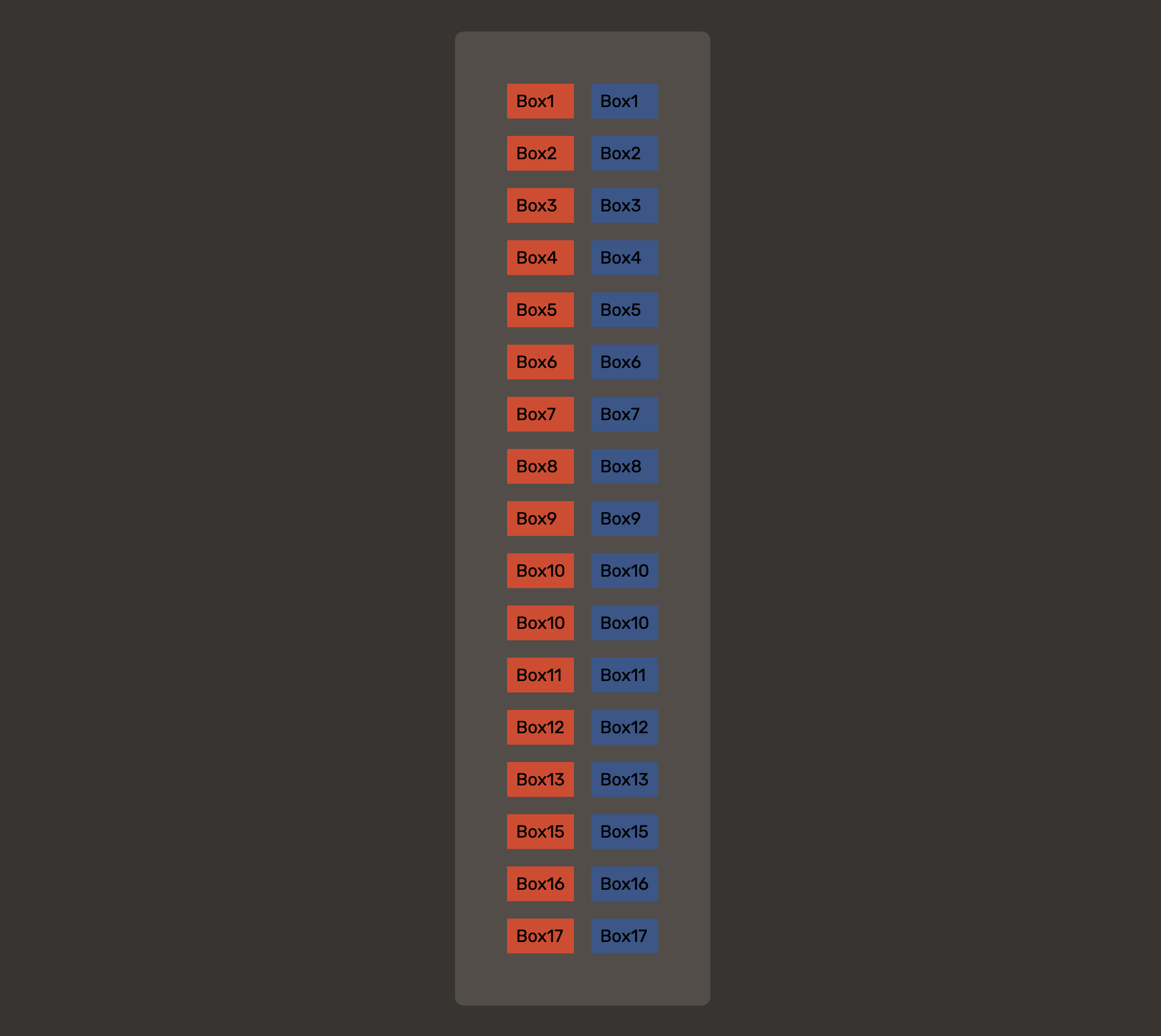
Finally here’s the proof that all of them work: